- Sheet
- Sample 02
- Status
- Launched
- Surface
- Web
- Cut
- Designer's cut
One website
No small print, no queues.
Visit live site (opens in a new tab)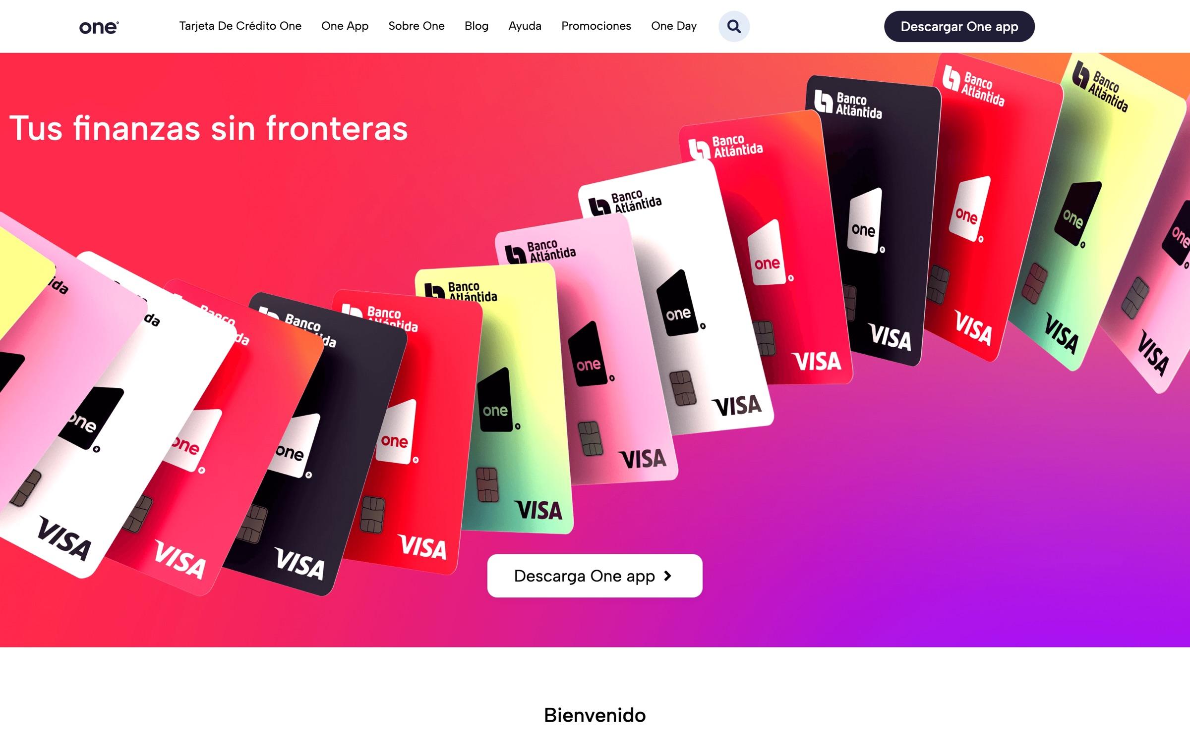
- 25Kvisitors
- 6.2%of visitors started onboarding
- ~1,550onboardings started from the site
- Product
- one.bancoatlantida.com.sv
- Title
- UX/UI Analyst
- Role
- Main designer
- Surface
- Web, desktop and mobile
A The job
The site has one job: get someone to start the application in the app.
The One card is applied for on a phone, so the website is the step before the first step. It has to make the same promise the app keeps, in the same voice, and then get out of the way.
B The page, top to bottom
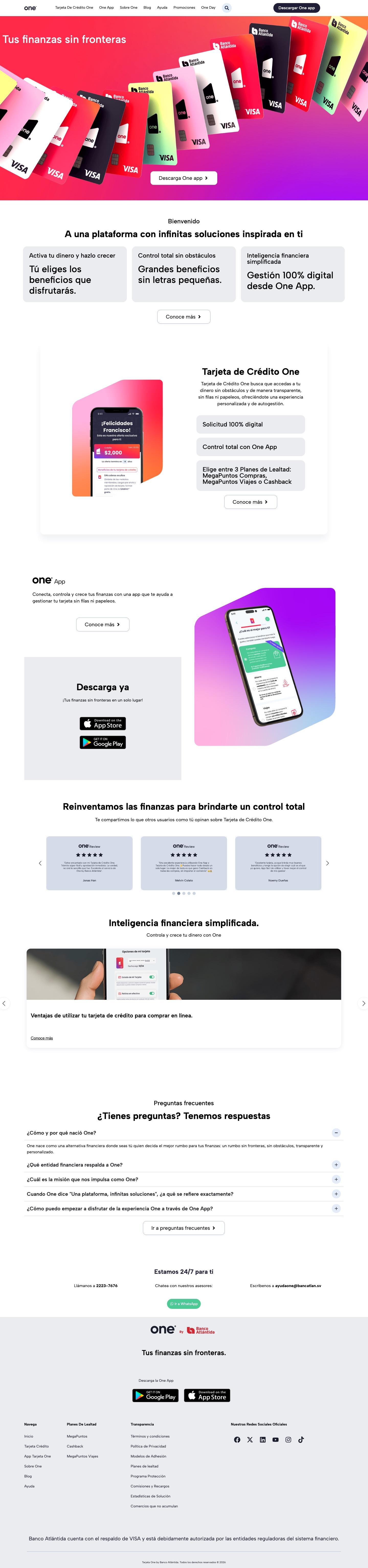
- 01
One line, one action
“Tus finanzas sin fronteras” over a fan of cards, and a single button: download the app. The same action stays in the header on every scroll.
- 02
Three promises
You choose your benefits. Big benefits with no small print. Everything managed from the app. Each is one short sentence.
- 03
The card, shown through the app
The credit card is explained beside a real app screen, the approved offer, so the product is seen before it is described.
- 04
The app and the stores
A second look at the app, with the App Store and Google Play buttons in their own block.
- 05
Other people's words
Reviews from cardholders, before the site says anything more about itself.
- 06
Help that reads like help
Articles on everyday tasks: changing a PIN, withdrawing cash, using the loyalty plan.
- 07
Questions, answered on the page
The first answer is already open. Below it, three ways to reach a person, around the clock.
- 08
Nothing hidden in the footer
Terms, fees and commissions, loyalty plan rules and resolution statistics are each one click away.
C The sections, 6 pages
Click a capture to view the full page enlarged.