A predictable start
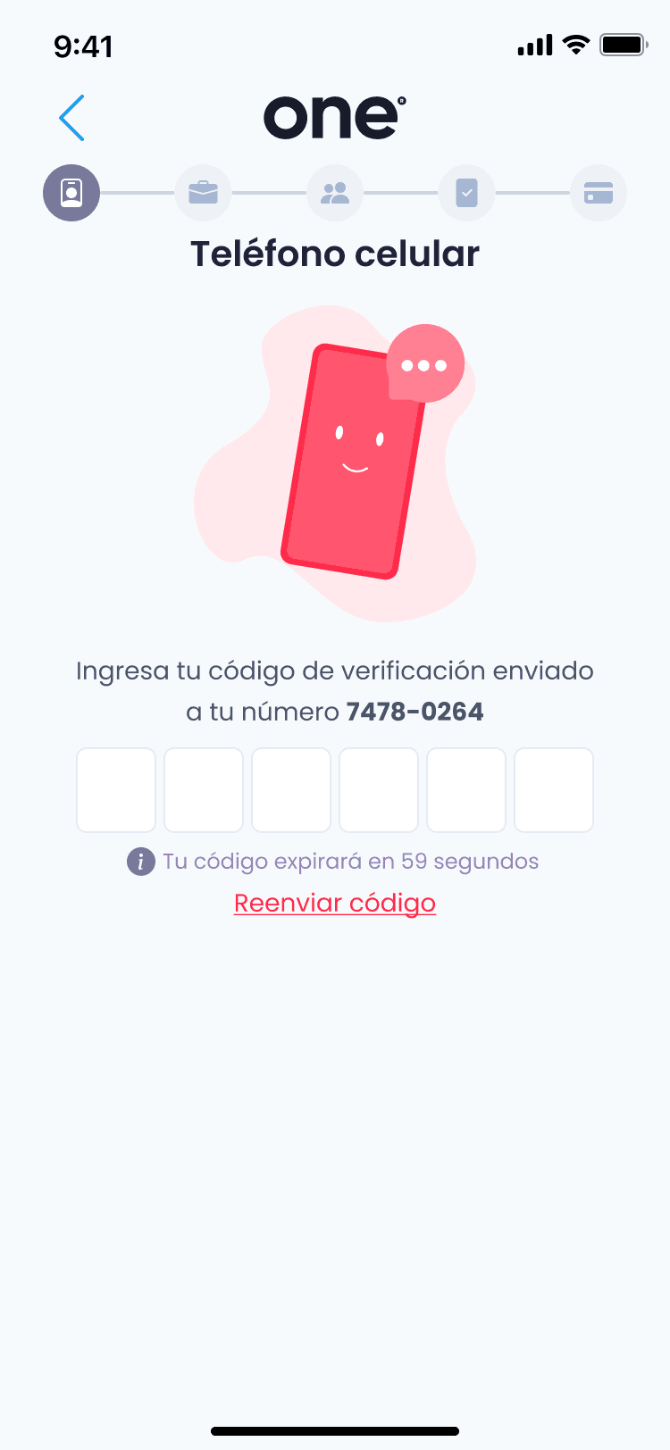
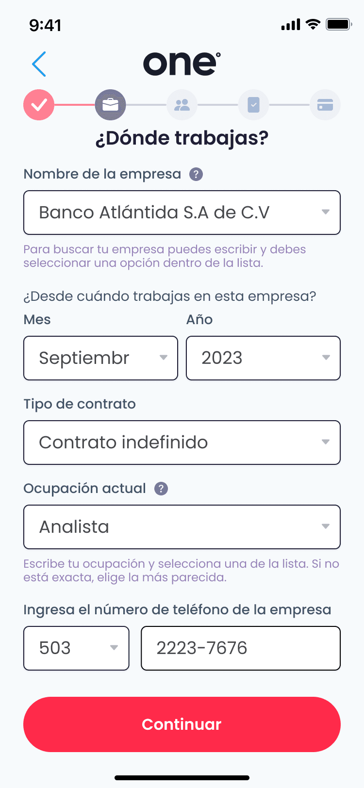
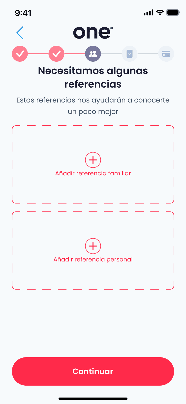
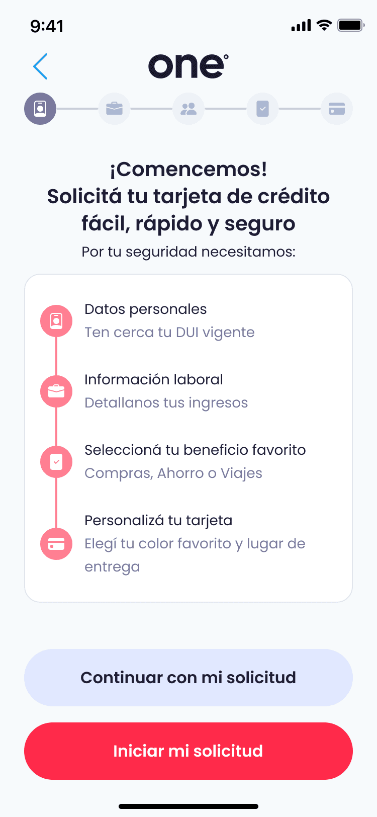
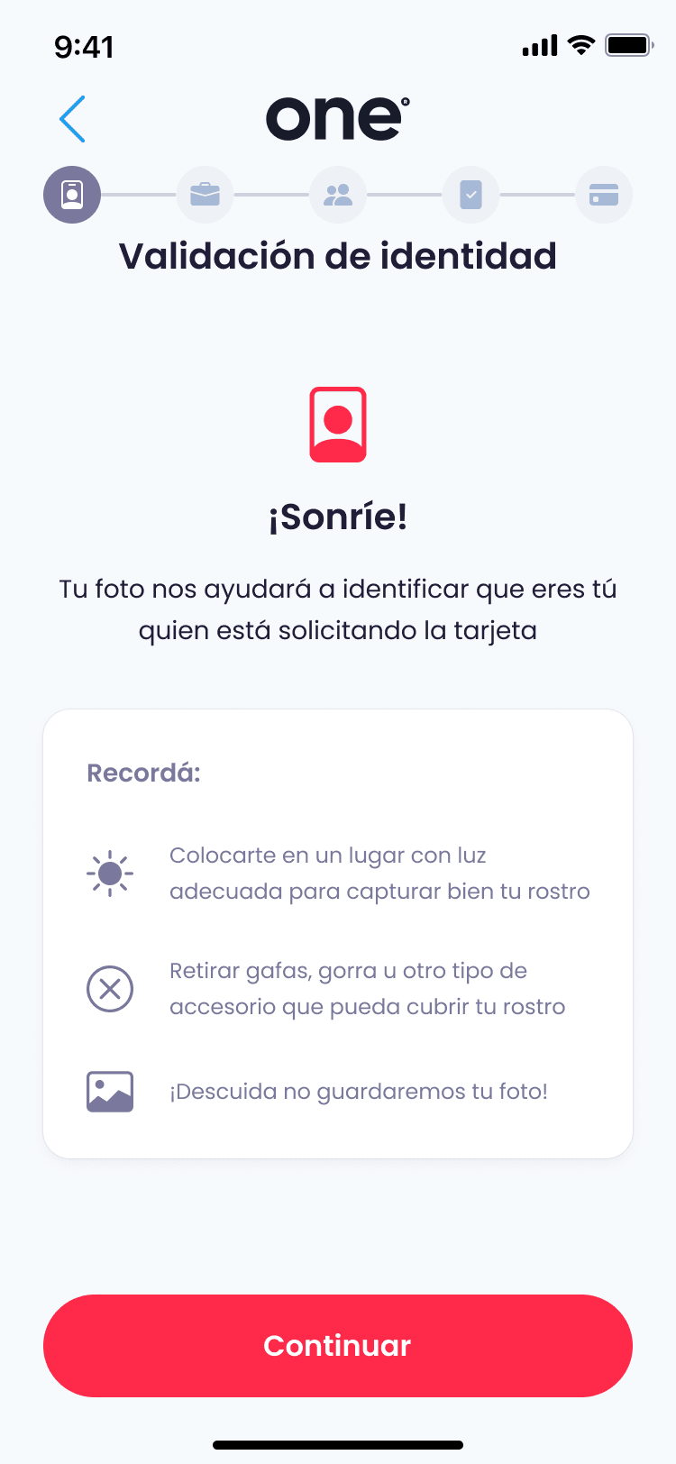
The first screen answers “what's next?” before anyone asks: a checklist of what to have ready and a five-step progress bar. Identity is checked with a guided selfie, so the strictest step is also one of the shortest.
Trust in the first 5 minutes. Card on the way in about 15.

People avoid credit because they don't trust it.
One is a credit card you apply for entirely on your phone, with no branch visit and no bank executive walking you through it. That leaves the screens to do the reassuring.
The job was to replace anxiety with control, without giving up fraud prevention or compliance. The first five minutes decide whether someone keeps going; the rest of the application takes about ten more.
The first screen answers “what's next?” before anyone asks: a checklist of what to have ready and a five-step progress bar. Identity is checked with a guided selfie, so the strictest step is also one of the shortest.
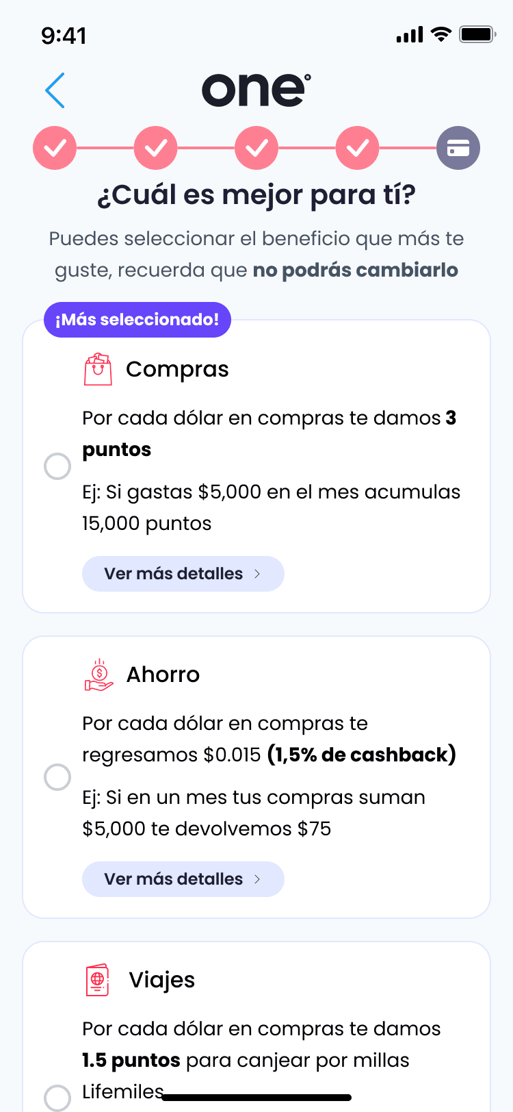
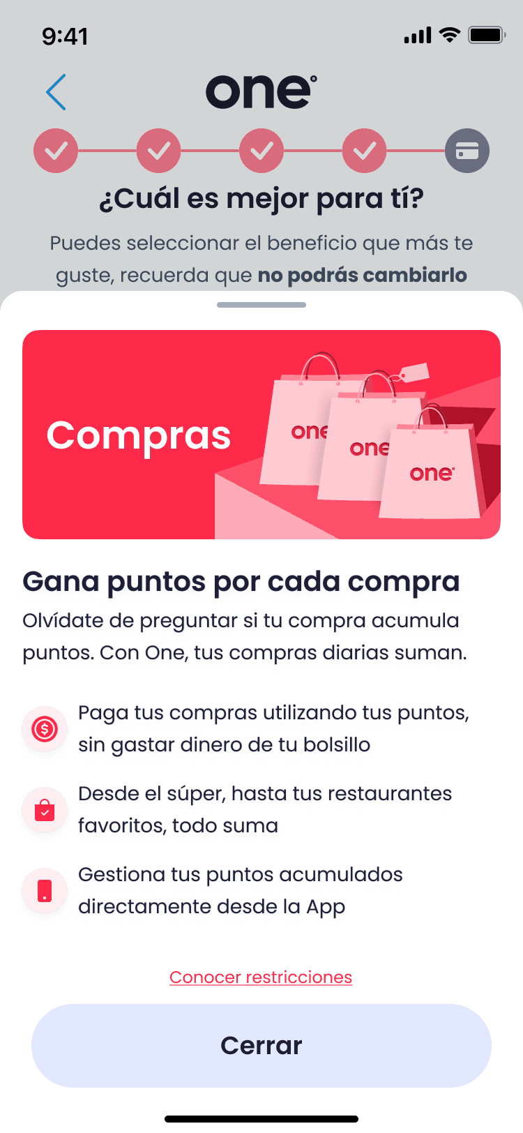
The decision arrives in the flow, with the limit and the rate on one card and how long the offer stands. Choosing a rewards plan is a guided choice between three, and the screen says up front that it can't be changed later.
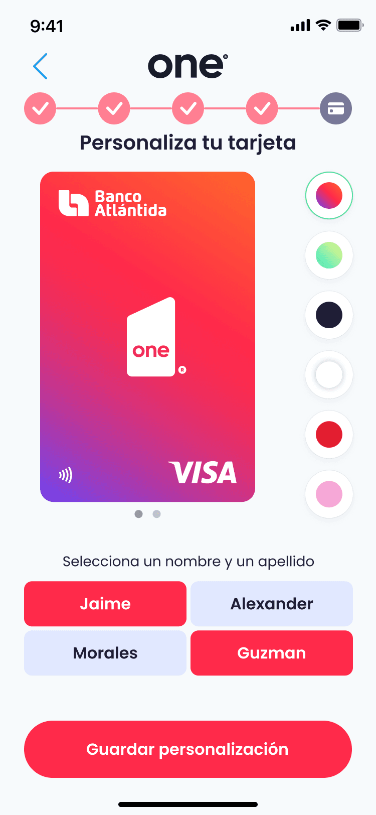
The last steps make a digital product feel tangible: pick the card colour, choose how your name appears, and read exactly how the benefits work before the card ships.
People tie credit to hidden fees, charges they never approved and losing control. Anxiety peaks at the identity and terms steps.
Preview everything: fees, limits and timelines. Show progress and what happens next at every step.
Security-first, benefits-driven and sceptical applicants all pass through the same screens, and it has to feel safe and simple to each of them.
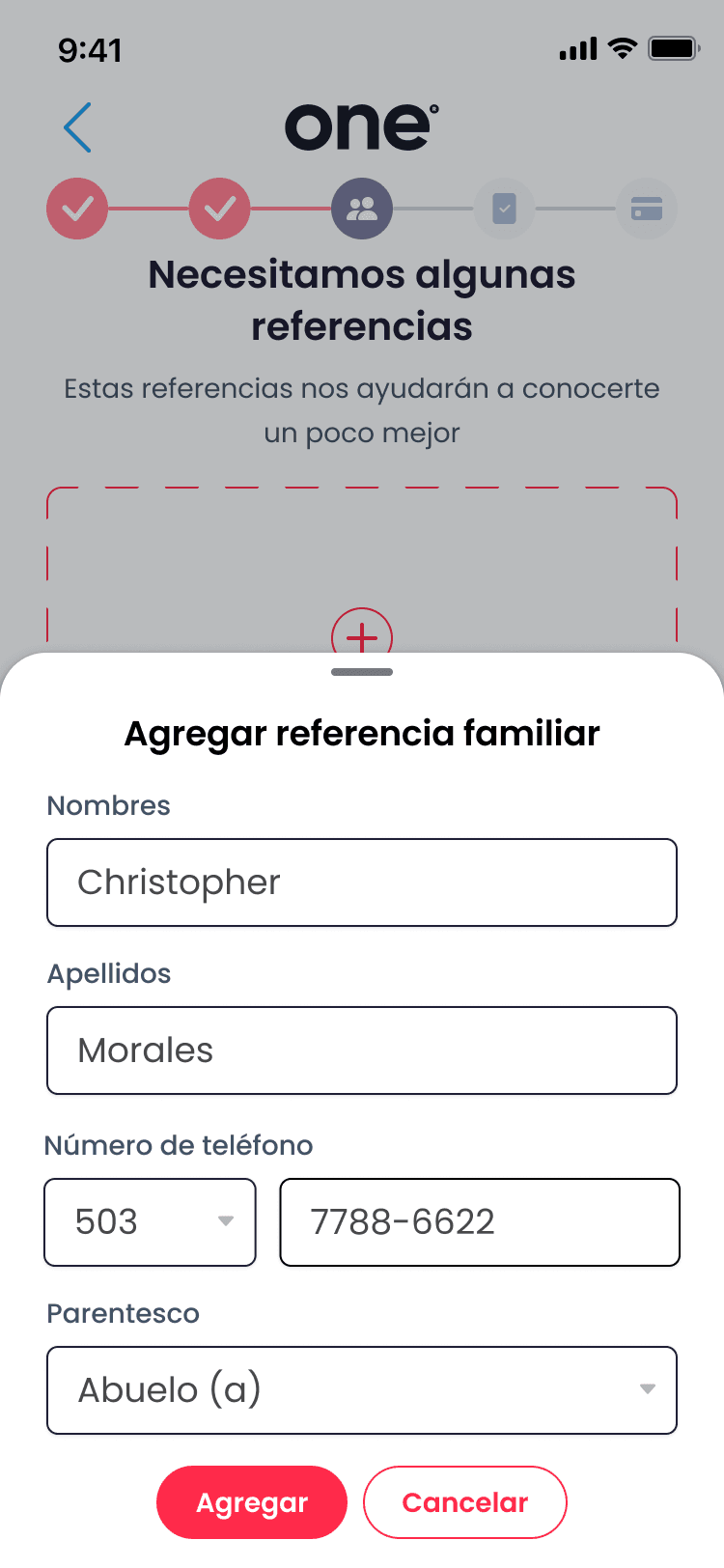
Disclose progressively, and let the microcopy adapt: reassurance, benefit framing and a way to get help at the right moments.
The applicant is in charge at every step.
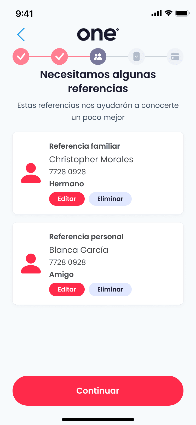
Clear states remove the guessing.
Speed with clarity, never confusion.
Fraud prevention that doesn't punish legitimate applicants.